QEP Launches New Brand Identity
Update includes new corporate art, packaging and product improvements.

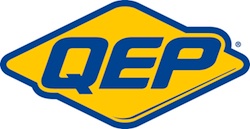
Q.E.P. Co., Inc. has unveiled a new brand identity for its QEP-branded products. This new brand identity is the first time the brand logo has been modified since its inception in 1979.
“As all great brands undergo transformation throughout their lifetime, it is now time to give a facelift to one of our most treasured assets” said Jamie Clingan, Sr. VP Marketing. "After careful research and many months of work, a decision was made to retain the legacy of QEP by keeping the yellow and blue that has become synonymous with the QEP brand. We have modified the diamond shape and brought the overall look into the current time frame while enhancing the readability of our brand, QEP."
Part of the logo transition included a new look and feel for the QEP-branded products and packaging. Clean designs, strong colors and simplifying the packaging to make it prominent at the retail level were all goals for this project. Smaller packaging cards and no plastic allows the customer to touch and feel prior to purchasing as well as offers a more environmentally friendly method of packaging.
The company has also refreshed its products.
“In the course of this process we recognized that user comfort is much more than a soft handle, it’s one of the greatest aspects of a design’s effectiveness,” said Jamie Clingan, Sr. VP Marketing. "Comfort plays right into efficiency, reducing the time and effort needed to perform at the same level. Therefore, we have made improvements to select products focusing mainly on the ergonomics of the handles."
Learn more at www.qep.com


